Industry Insights
3 Reasons Not to Use Maps on Your Mobile Landing Pages
Seeing business locations on a map may be visually appealing, but this feature can introduce many usability issues on mobile devices. So when it comes to your store locator and other mobile landing pages, should you include maps? Maps are one of the most enduring tools to exist in human history. Some of the earliest […]

Tyler Anderson
Jan 30, 2019

Seeing business locations on a map may be visually appealing, but this feature can introduce many usability issues on mobile devices. So when it comes to your store locator and other mobile landing pages, should you include maps?
Maps are one of the most enduring tools to exist in human history. Some of the earliest forms of maps can be seen on cave walls, plotting the locations of distant stars and constellations. In today's digital world, maps are just as prevalent as they were thousands of years ago. In fact, today's maps are more accessible — and more accurate — than ever before. And they help billions of individuals get to trillions of locations across the world every day.
In business, the difference between securing new a customer or losing out on their business often comes down to the consumer's ability to find your location. The ubiquity of smartphones means maps are now accessible anywhere, any time. So maps on mobile pages may seem like a no-brainer at first glance. However, research shows that maps on mobile landing pages are unnecessary — and can actually hinder consumers' efforts to find you.
Research from the Nielsen Norman Group shows that an interactive map experience on a mobile landing page has pitfalls that can trip up the user experience, potentially frustrating visitors and reducing user engagement.
3 major issues people experience with maps on mobile landing pages:
- Difficulty Scrolling
Interactive maps on mobile landing pages will often interpret a user's touch, with intent to scroll down the page, as a command to pan the map. This confusion, along with subsequent accidental zooming as the user tries to get out of the map and back to the page, is a recipe for irritated and discouraged consumers. - Chaotic Pin Clusters In a narrow mobile layout, location pins in a high-density area of the map frequently overlap — or completely cover other location pins. This makes it extremely difficult for a user to tap the desired location pin, and can lead to inadvertent taps on the wrong location.
One common solution to this issue is to aggregate a group of nearby locations under a single pin or icon (often with a number denoting the number of locations within that specific group). This is sometimes referred to as pin clustering. Tapping one of these pin clusters often zooms in, and redraws the map to show all of the individual locations within that selected cluster. However, this simply serves as a bandaid to a larger issue, and creates a complicated, multi-step process for users. - Slow to Load (And Imprecise)
Google has found that 53% of mobile site visitors leave a page that takes longer than three seconds to load. Maps are slow to load and can add significantly to your final page load time. Even worse, the map may load imprecisely, or only partially load, leading the user to prematurely interact with it by using repeated gestures that yield no noticeable response (further slowing down the site as it tries to run those redundant interactions).
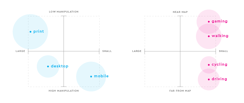
Leading web map maker, Mapbox, found that the simplest map solution is often the most useful — and the safest. The research found that maps are used in a variety of situations, ranging from low manipulation to high manipulation, depending on the device and the size of the map. For example, some users may be operating a vehicle while they are using your map on a mobile device. This activity requires high manipulation from the user on what is a typically a small screen (this combo would lead to the user making more mistakes than one where the user was sitting at home using a map on a desktop computer). Ultimately, you have to consider all use cases and create an experience that leads to the fewest number of frustrations and misclicks from all users.

Mobile maps require high manipulation and users are constantly fiddling as a result of their current activity and desired result.
When it comes to getting people from an online search to your front door, it's most important that you provide accurate location information — both on your local mobile pages, and across the many search engines, apps, social networks, and other AI-driven discovery services that consumers are using to find information. Providing the user with the correct business name, address, hours of operation, and proximity from their search coordinates is paramount — the visual form that data is presented in is secondary. However, if you are going to push ahead with using maps on your store locator pages, give users the option to collapse the map and offer a list view of results, instead.
If you run digital marketing and are looking for the next strategy to focus on, download our whitepaper: The Professional SEO's Next Step: Digital Knowledge Management.
